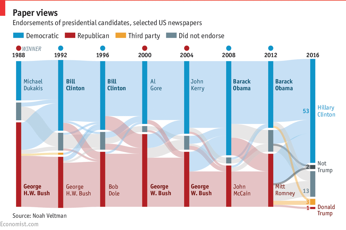
A couple of days ago, The Economist's Graphic Detail blog had a write-up and visualization of newspaper endorsements of presidential candidates. The visualization is a static image and I wanted to tweak it. Specifically, I wanted to see what the links in the diagram would look like if they were a gradient rather than all one color akin to Nadieh Bremer's work to make chords in a chord diagram use gradients. That post links to a stackoverflow post discussing exactly what I wanted to do so at this point I was thinking "oh, this is basically done for me".
The source data was easy to find and while I'd personally never done anything with Sankey diagrams, I knew that I'd seen a d3-based Sankey diagram. I downloaded the data, grabbed a copy of sankey.js and started tinkering.
I quickly realized that transforming the full dataset from the .csv to something to drive a Sankey diagram would take a little work. Instead of putting in the effort, I decided to make a fake dataset so I could explore whether or not the gradient-link idea was worthwhile. Here's how that worked out (and the data I cooked up):

I thought that looked cool so I decided it was worth the trouble to re-create what was on The Economist's blog. It's worth noting that The Economist's graphic is for "selected US newspapers". I figured this meant that all data from Noah Veltman's project was being used but I later realized that isn't the case. The Economist's diagram is limited to data from 1988 – present and is only for newspapers in the dataset that have weighed in on the 2016 election (~60 publications/election). What I ended up creating is a bit different: I used data from all publications for the 1988 – 2012 elections (~100 publications/election).
To get the data in shape, I decided I needed to do a few things:
- filter out
Unknownendorsements as well as cases where a paper endorsed multiple candidates - create an object with publication names as keys and values as an additional object with election years as keys and the endorsed candidate as the value
- create an object to look up party affiliation for each endorsed candidate
- create another lookup object to map a string like
1996demto the corresponding candidate to label bars in the diagram - create a list of election years
- build a final object I referred to as
flowsto keep track of which party's candidate a publication endorsed from election to election
The final flows object was then the basis for an array of objects to hook up to a Sankey diagram.
After a few false starts (there are always a few), I ended up where I wanted to be:

But there was a problem: I don't like it. With a denser diagram the gradients muddy things. I decided to copy The Economist's style and make links the color of the candidate they're going toward:

Better! I like the additional contrast and it's easy to see if and when papers have jumped party lines.
An additional problem that surfaced while making this was that bars representing party endorsements weren't staying consistently ordered from election to election. Unsurprisingly, someone else had already had this problem with d3 + Sankey diagrams and there was a convenient solution posted to stackoverflow.
The final thing in my re-creation of the chart to decipher was the small mismatch between size of the links and some bars. This is easiest to see in the Republican bars in the Clinton/Dole and Bush/Gore elections. After giving it some thought, I think this is a result of publications making an endorsement when they hadn't previously. I haven't dug into the data to verify this.
Here's the interactive version of that last image: Re-creation of The Economist's Sankey diagram showing presidential candidate endorsements for many publications.
My gut reaction to the static graphic turned out to be wrong but I can now say I've made data from a .csv file into a Sankey diagram with d3, so I've got that going for me, which is nice.
My re-creation doesn't include the 2016 data but that's mainly because it's so weird (refer to the original graphic) and, let's be honest, who isn't sick of this election yet? Please vote and let's get all this behind us.