Make a D3 chart from an HTML table
Let's say there's some data in a table in a website. Tables show raw data well. However, it's not easy to see trends or variation in a particular dataset. For that, we need a chart.
Now that I've stated the obvious, let's move on to something practical. I don't play fantasy football, but at some point I did get roped into a weekly NFL pick'em league and it's pretty fun. Full on fantasy football still seems like overly obsessive nonsense to me (sorry-not-sorry).
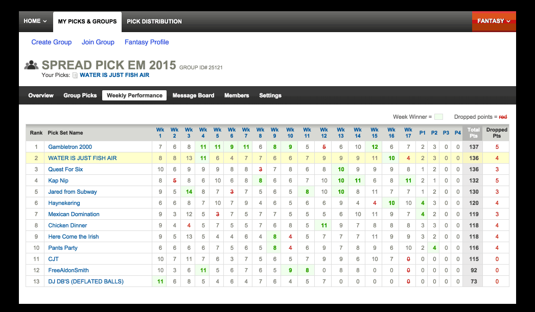
Once the regular NFL season ended, I wanted to see the ups and downs in my group. As far as I can tell, Yahoo doesn't provide a chart that shows rankings over time so what's a web-person to do? Make one, of course.
This is what Yahoo provides: 
Getting the raw data
It's an HTML table so I grabbed it via Chrome's dev tools:
- right-click the table, select "Inspect"
- in the dev tools Elements panel, right-click
tableelement - select "Copy"
- select "Copy outerHTML"
- paste into a file
- save the file (I'm creative so called it score-table.html)
Here's what that looks like:
And here's the HTML as a gist.
Create a .json file from the HTML table
With the HTML table in a local file, I used x-ray to pull out scores and write a .json file with said scores. Here's the script I wrote:
Create a .json file to drive a D3 chart
Once the weekly data was pulled out of the HTML, it was time to transform that into something to drive a D3 chart. After some reflection, I decided the structure needed to be an object where each property is a team name and the value for each property should be an array of rankings. That way, each element of the array would be a team's rank in a given week.
That seems straightforward: add up scores week-by-week, sort by weekly scores and assign ranks. But wait, the rules of the pick'em include dropping the lowest score. I wrote a script to do that and kick out a few .json files:
The .json file used for the chart is teams-ranked.json. The additional files are structures I thought I might use but haven't used for anything yet.
One thing to point out: it's JavaScript and yet there isn't a single occurrence of function. I think that's wonderful and it's possible because of es6.
Make a chart
With an appropriate .json file, it was time to make a chart. The end result is on bl.ocks.org (corresponding gist) and looks like this:
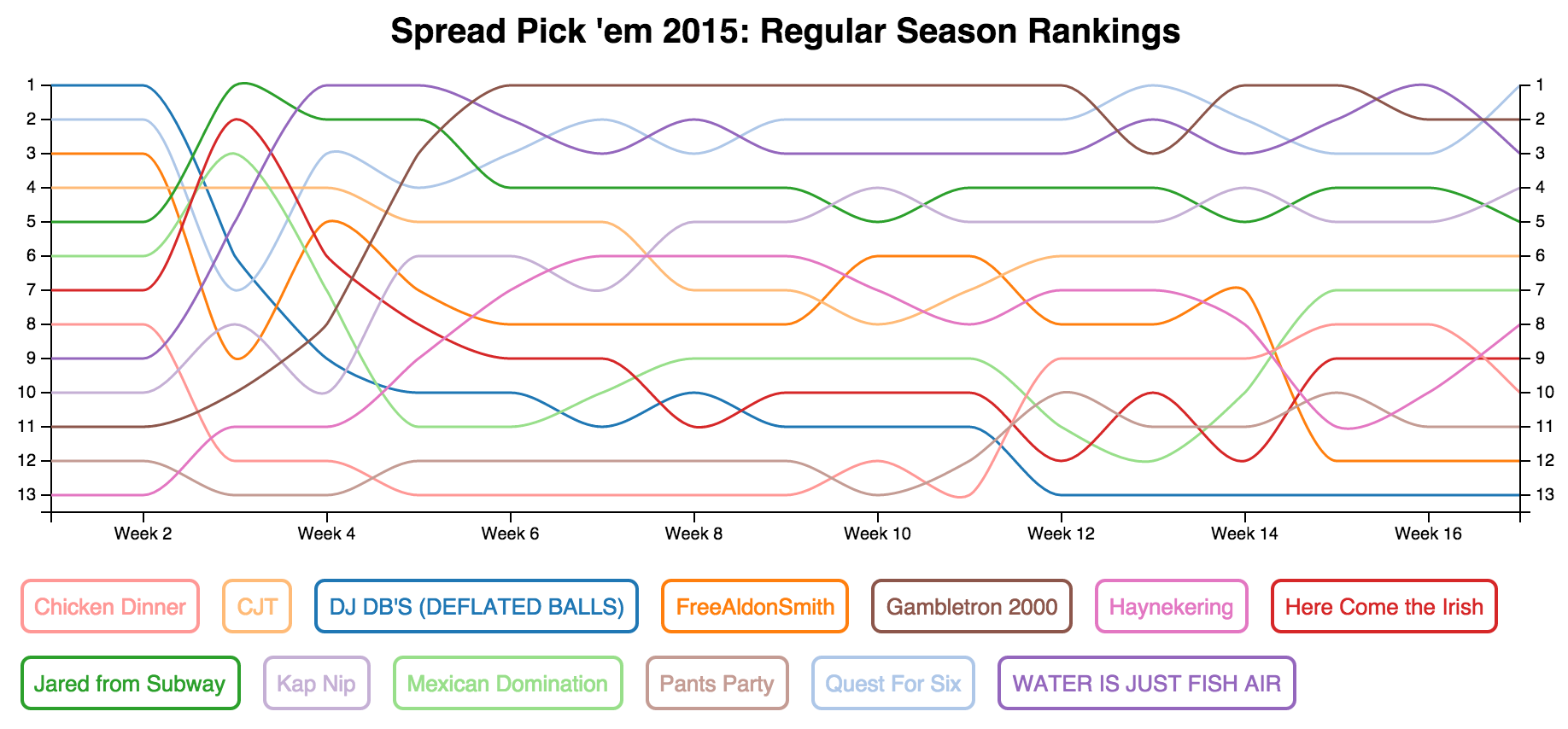
I'm pretty sure that a good chunk of the chart code originally came from a D3 line chart example but I'm not certain.
This chart was the first time I'd used monotone as the interpolation option. It's nice because it smooths lines but preserves highs and lows, unlike basis interpolation.
Once's the data is available, the code:
- pulls out teams names using Object.keys
- creates a new array of objects from original object
- gives each team an index which is later used to link legend entries with lines in the chart
- sets domains on the x and y scales with a little padding on y so the data doesn't step on the y-axis
- adds axes to the chart area
- draws the data using data-enter-append
After drawing the data, I added a legend by creating a div from each team name and giving making each div's color and border the same as the color of the corresponding line on the chart.
Beyond the basic chart, I added some interactivity: click a team name to make the corresponding line on the chart bold and vice versa. To me, it's cool to see how teams in the group went up and down. And also how my team, WATER IS JUST FISH AIR, had first place a couple of times but it slipped away. There's always next year.